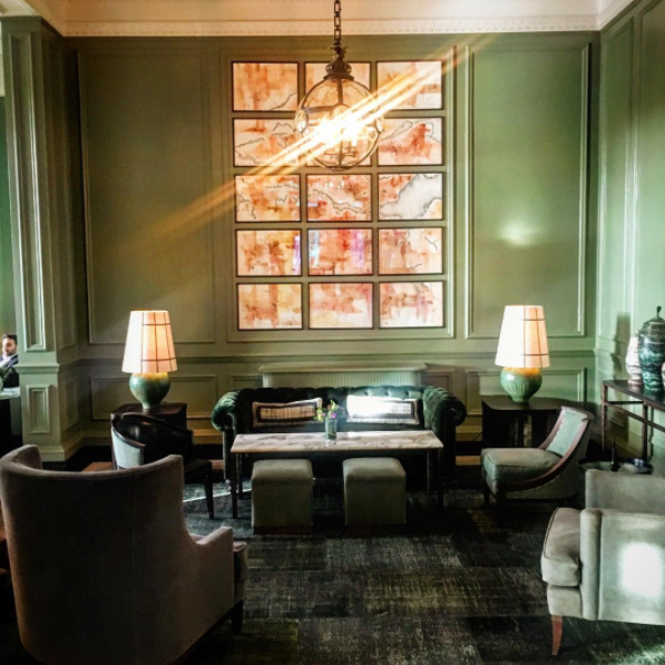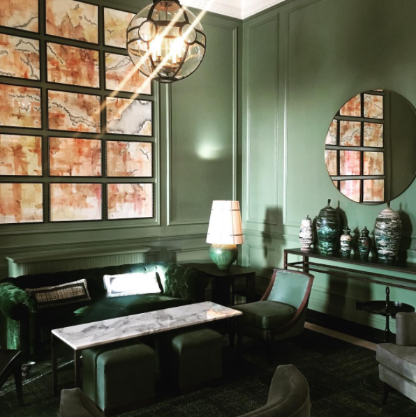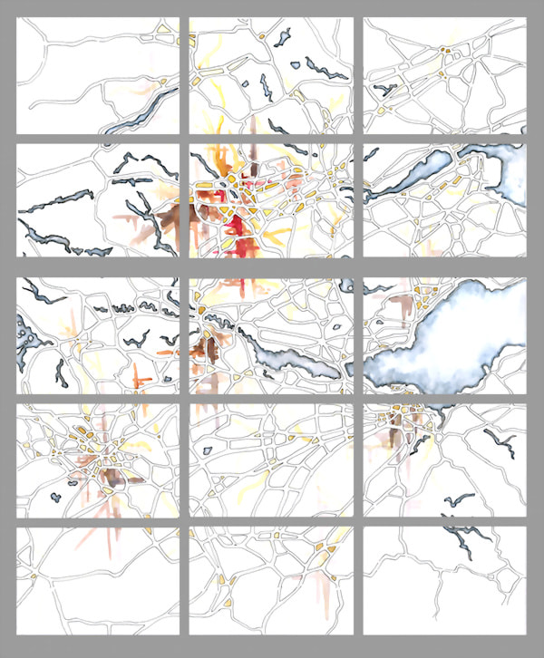
Last fall I was contacted by David Collins Studio to work on artwork for the lobby of the Gleneagles Hotel near Auchterarder, Scotland.
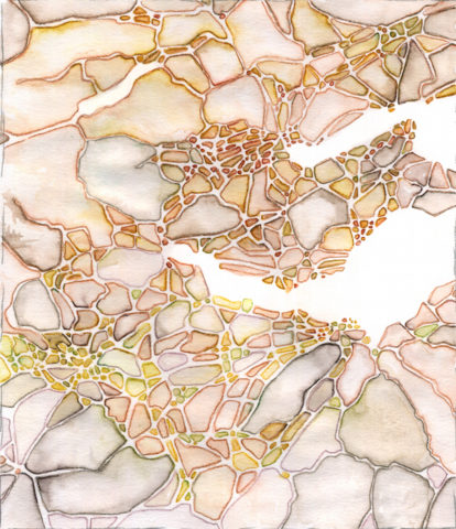
The image they liked was a more abstract imaginary map with lots of brushstrokes, along the lines of my Schema series, and the source image was a map of the region that the hotel had in its collection.
From the outset the project was going to be a challenge to design because of the scale. The brief was to make 15 panels, each around 23” x 17”, hung as “tiles” that fit together into a map.
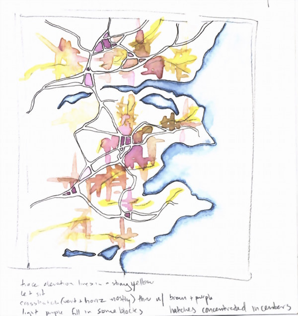
My usual process involves drawing a few thumbnails based on the area and focus of interest, developing a chosen thumbnail into an intermediate-sized sketch, and then expanding that to draw the full-scale drawing.
With this project I was still designing it as a single image (up until it got to a larger scale), but I knew there would have to be more steps between thumbnail and full-size than usual. As it turned out, to finalize the design we actually went in between scales a bit as well.
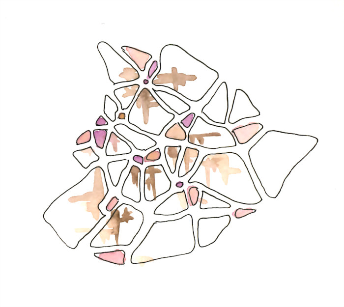
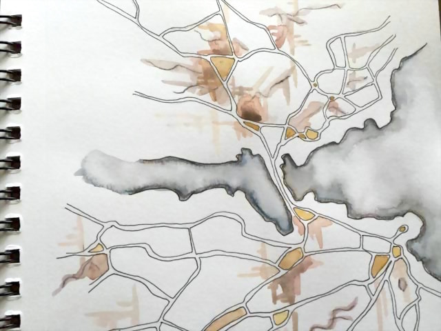
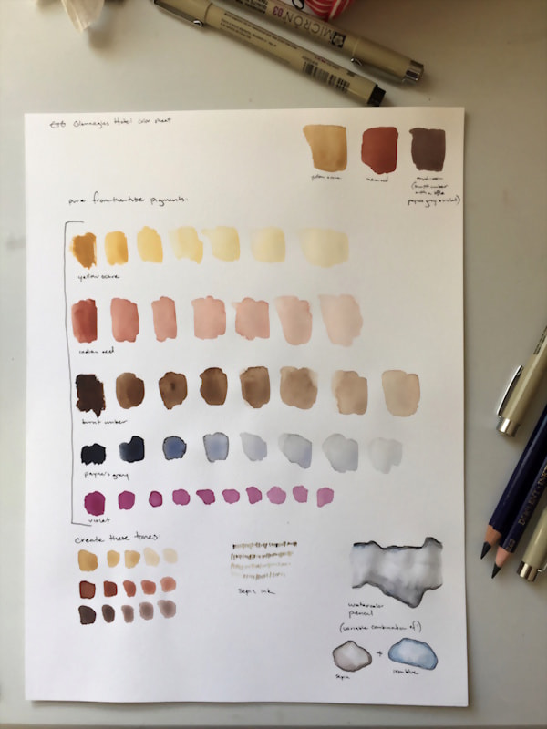
Choosing colors was also a preliminary concern because the work was going to be hung as an original artwork, not as a print, and the colors needed to match the hotel lobby’s decor.
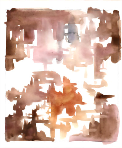
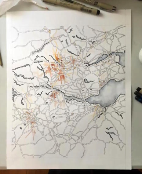
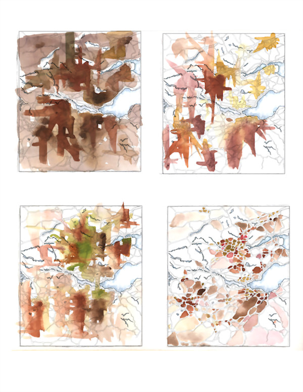
Because of the style chosen, the image ended up being designed first by the streets and waterways, and the color distribution was determined later with a smaller-scale sketch overlay. I did several color sketches on an overlay over the roads, composited them together, and the studio chose an arrangement.
Two of the overlay options for the map design
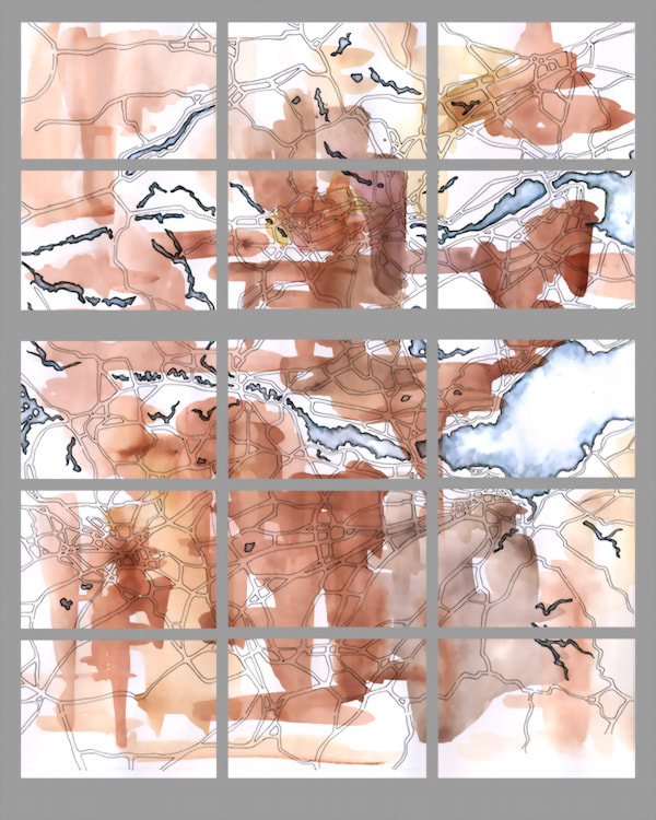
Once I got to the point of expanding the design to the individual panels and working on them, scale came into play again. The first steps (tracing the roads, inking the design, and filling in the water areas with watercolor pencil) were relatively easy, but I had to start thinking at different scales once it came to painting in the color.
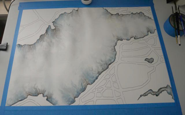
I had my directions for the overall distribution of colors, but within each panel there was a lot of space! Detail that I would have glossed over at the small scale of the color sketch was much more stark at a larger scale. Additionally, when the roads were scaled up they became less apparent. I worked on subtly highlighting them using the watercolor strokes, and at the end of the project the lines of the roads got retraced as well.
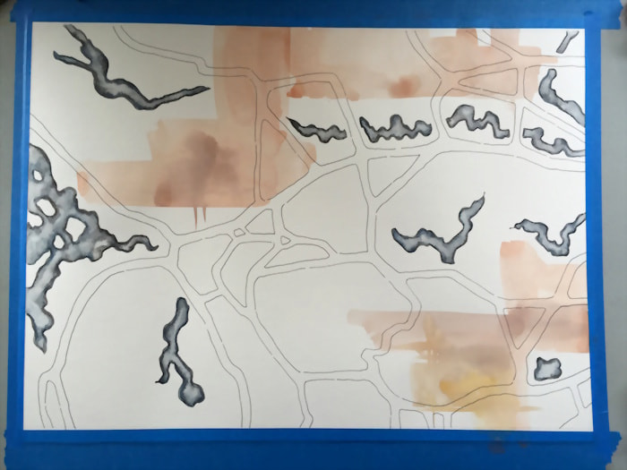
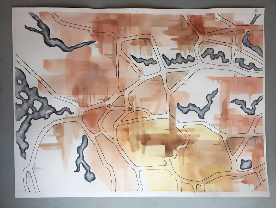
(Everything comes back around—I’m finding myself using a similar style (i.e. adding watercolor with alternating indifference and attention to road boundaries) with recent projects now!)
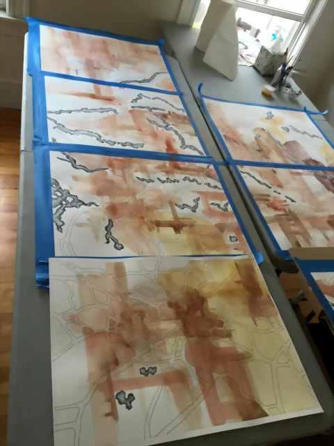
The project soon took up a whole room:
I was thrilled to see the first photos from the work installed. I wasn’t able to ever see all the panels together in person (I used a digital composite of photos of each panel that I kept updated with their current progress as a tool to adjust color over the whole image and make sure individual panels matched up), and I loved seeing it in the space.
