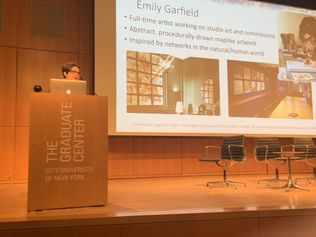
I’ve been collaborating with mathematics professor Christopher Hanusa on exploring my maps through various mathematical lenses, culminating most recently in a joint presentation on analyzing and datamining imaginary maps. The abstract for the talk, held at an offbeat math conference called MOVES (Mathematics of Various Entertaining Subjects) through the National Museum of Mathematics, was as follows:
What can mathematics say about imaginary places? We explore a variety of statistical measures of sci-artist Emily Garfield‘s Imaginary Maps collection to ask and answer questions about the demographics, neighborhoods, and fractal nature of her imagined places. Our destination will surprise you. All aboard!
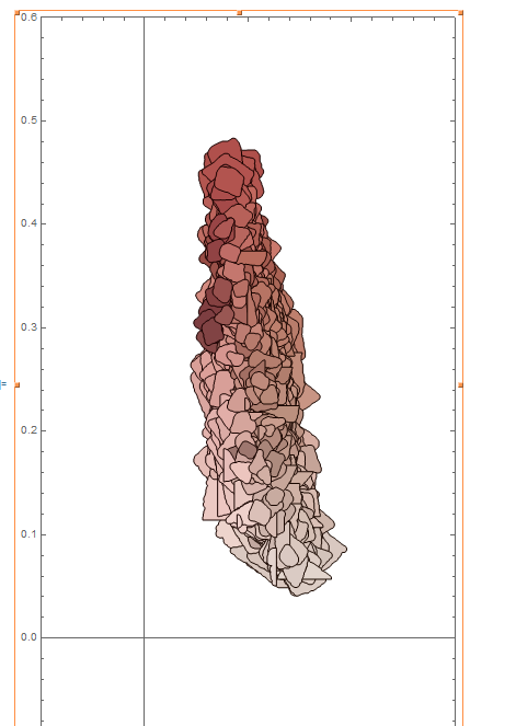
His original inquiry, which set us off on our collaboration, was whether he could draw mathematically (using a computer algorithm) the kind of map that I invent physically. It’s a question that might seem worrying, but I absolutely embrace it—I’m fascinated to know whether what I draw can be generated, and while I’ve done my own forays into coding and generative art I’m not there yet, and it’s more efficient to team up with an expert! I would not have anticipated approaching it from a math angle but the collaboration has been fascinating.
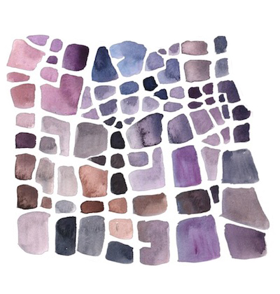
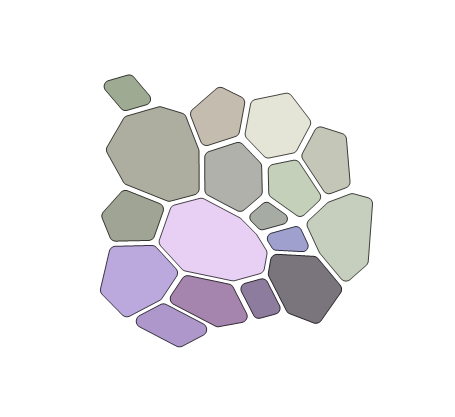
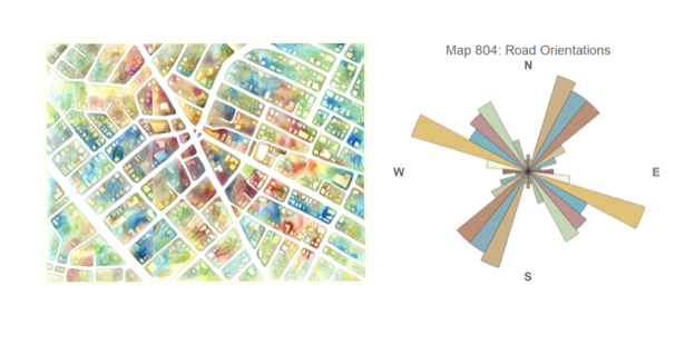
Watercolor map (left) and generated map (right)
I also wanted to know whether my maps had a fractal dimension, and if so how fractal they might be. They’re often described by viewers as fractals, the way that other organic forms are, so I was curious if that quality could be proved mathematically, and lack the resources to do so on my own.
As we collaborated I also became fascinated by the possibility of algorithmically proving how “maplike” they are. When I display my imaginary maps, viewers often imagine them to depict particular places—I would love to know how close their forms actually are to the forms of real maps.
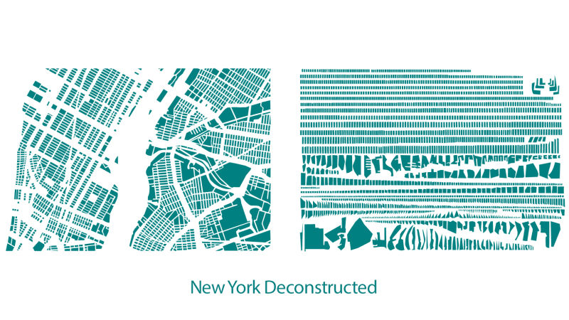
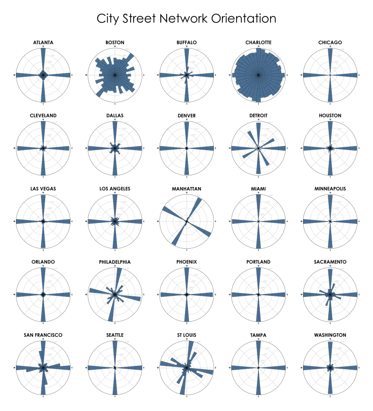
In general, I thought it would be interesting to datamine them for their demographic/geographic “stats”. I was inspired by a few urban datavis projects I’ve encountered online, particularly the deconstructions of Armelle Caron and street orientation analysis by Geoff Boeing.
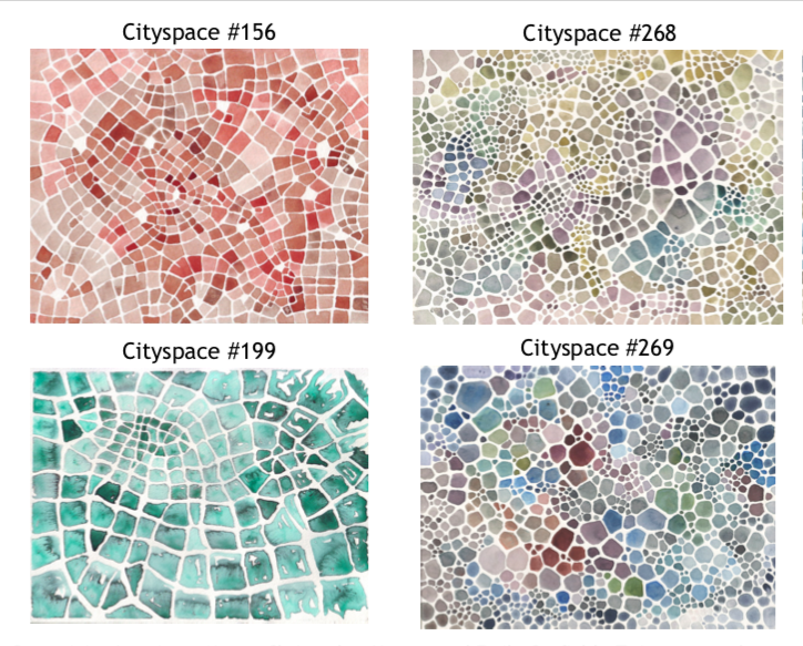
We chose just my “mosaic” style maps to analyze, which are made up of watercolor blocks that nest to form grids of varying order. These are particularly abstract, so they were simpler to analyze. Chris focused his analysis on the distribution of color, the size and shape of blocks, the density of blocks, and the size and orientation of roads.
Some of the most compelling information was about the use of color. When you rearrange all the blocks of my map “Terra Cotta Cross-Section (Cityspace #156)” by hue and lightness, they almost form their own map—I would be very curious to trace and map that again, making a “meta map”!
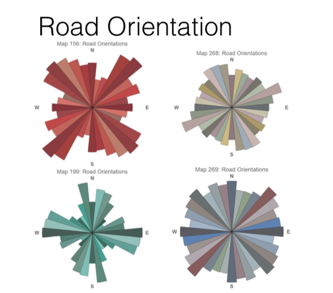
I also greatly appreciated seeing the relative road orientations, like in Geoff Boeing’s analysis above. Here are the orientations for 4 of the maps we analyzed:
And for comparison, here’s the orientations of a commission I did of a real place. Even in abstracted commission form it’s still much more consistent than my abstract imaginary places, which tend to be less gridded:
I was also very interested in the analyses done of how the blocks are grouped into neighborhoods*. I’d be curious to see more analysis of the “neighborhoods” of my imaginary maps in the future!
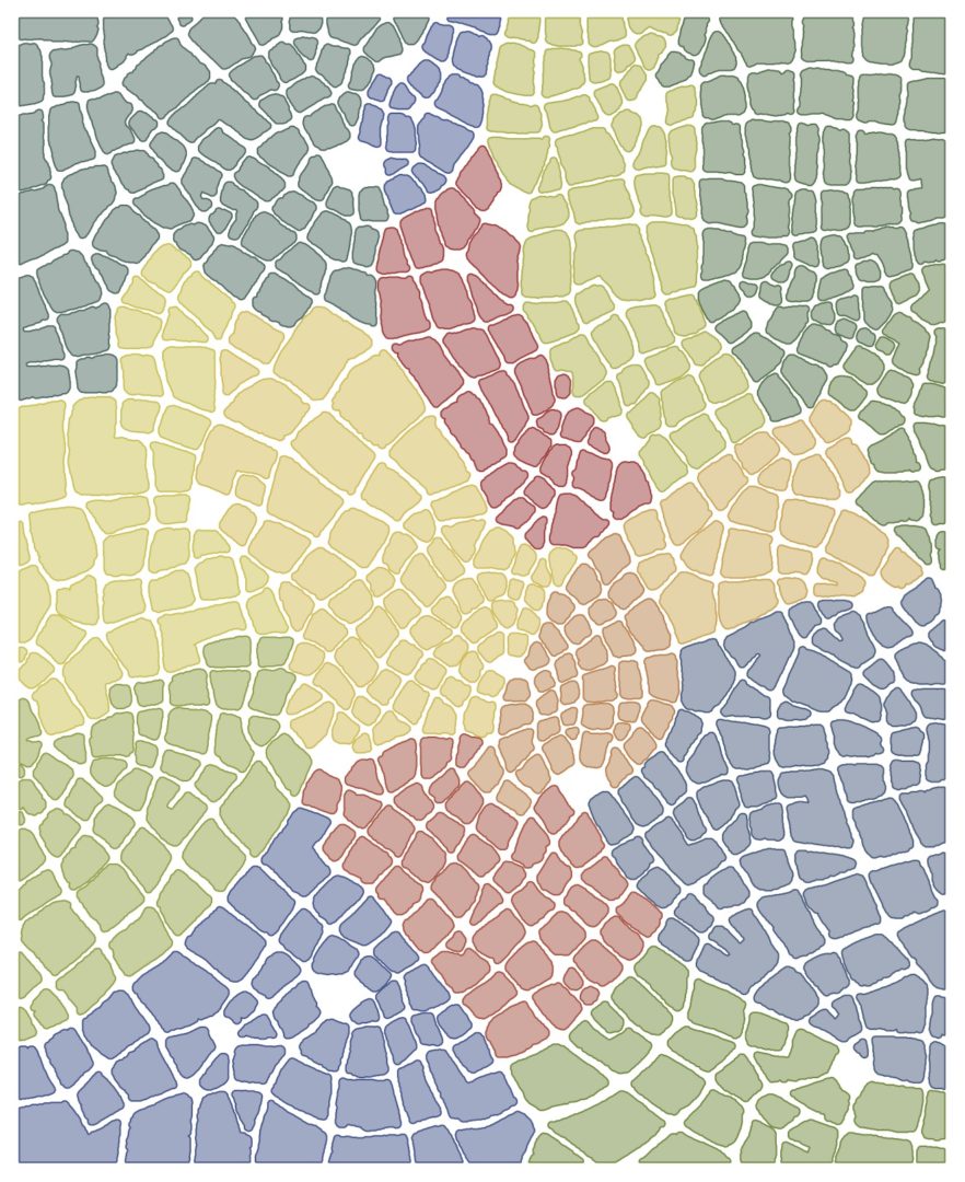
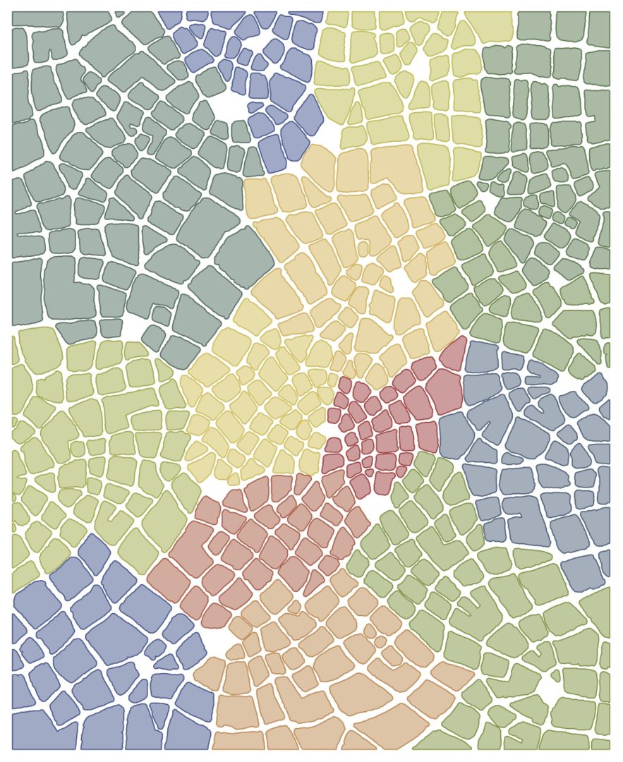
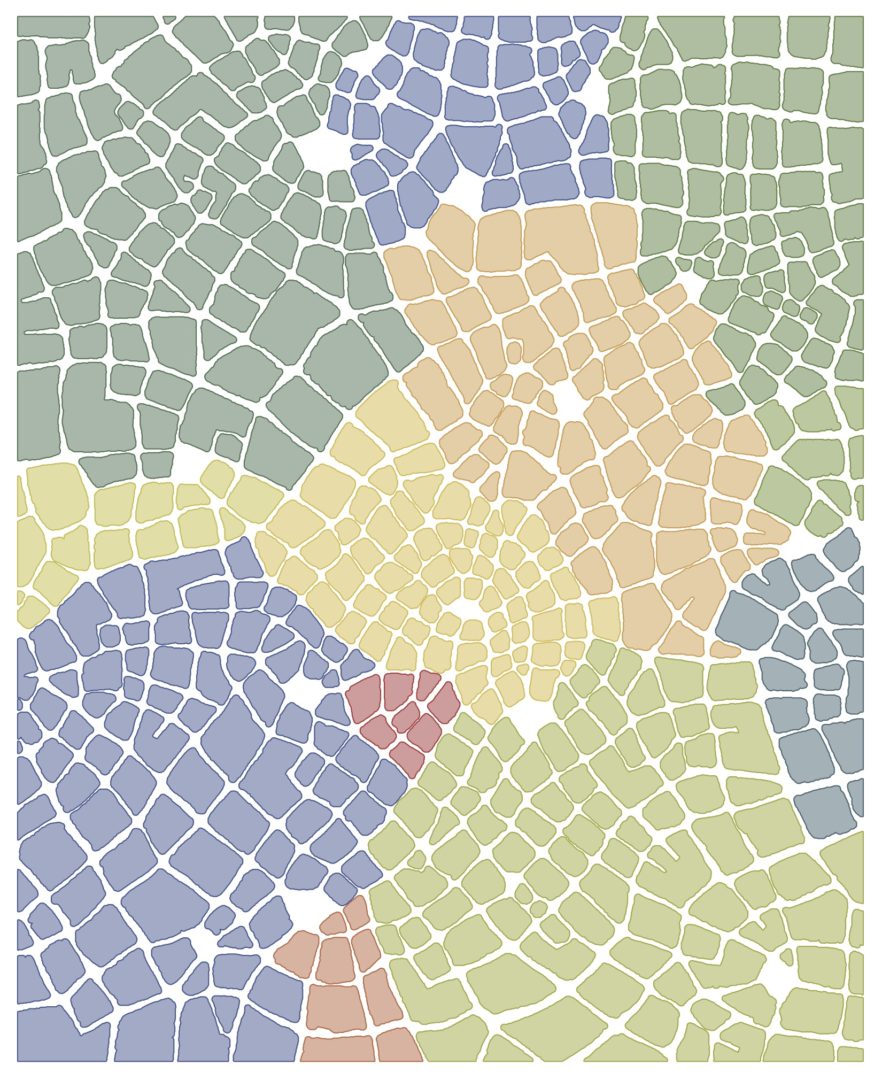
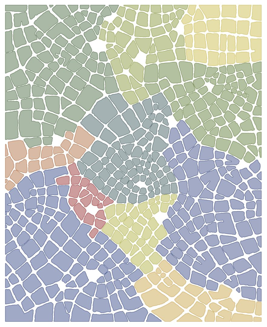
*Note: “Neighborhoods” actually has a specific meaning in graph theory that’s different from how we use it to describe parts of a city! Read more about graph theory and specifically about neighborhoods.
The takeaway we presented at MOVES was generally that for some of the parameters studied, my maps did have consistent patterns, especially of color. I look forward to continuing the research about comparing them to real-world maps.
You can view the presentation’s slides on Chris’s website here (PDF). The presentation at MOVES began with an introduction to my work and its relation to networks in the natural world, as well as its iterative construction. The rest of the presentation explained the analyses used and their results, as well as our takeaways and next steps.